How to print great B&W photos - introduction
Details on using the Epson R2880 to print black and white photos with subtle grays and deep, rich blacks. You need Adobe CS4 and the PhotoGP plug-in, and some tweaks to the Gutenprint xml files that describe the inksets and other printer properties. The results are worth the pain...
Before we begin
The following article assumes some familiarity with colour management, Adobe Photoshop, and digital photography in general. College level algebra and some XML knowledge will also be helpful. The computing environment I used for these tests was an Intel Core2 quad processer with 3Gigs of RAM running Windows XP (SP3) and Adobe Photoshop CS4.
If you are in the process of dipping your toes in the wonderful world of digital photography and printing, especially black and white, I recommend the excellent website of Paul Roark. I use his wonderful concoctions for archival carbon ink printing, and his black and white information page is a treasure trove in the field of B&W printing.
The R2880 and Gutenprint
The Epson R2880 can print on paper up to 1.3 mm thick and about 30 cm wide. It comes with an advanced black and white mode in its printer driver. You can get good results with that driver and Adobe Photoshop. You can get even better results with the excellent open source Gutenprint drivers and Photoshop CS4 by using the PhotoGP plugin developed by Dickobraz, again with an open source license.
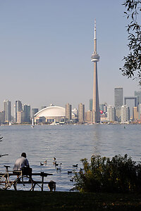
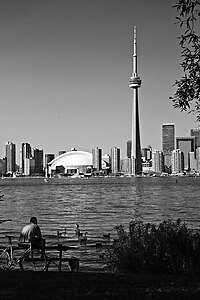
As an example, here is the original colour digital photograph taken with a Nikon D90, along with the black and white version that I printed. Unfortunately, the screen shot does not show the richness of the blacks and the subtle range of grays in the actual print. I used a sheet of 33cm by 48cm Inkpress Pro Silky paper for the print.

|

|
Digital inkjet printing uses tiny droplets of ink crowded more or less together on the paper surface to create the illusion of varying density. Smoothness in the print output is achieved when there are many droplets of ink in a given area rather than a few. For example, if you print with 50 dots per millimetre (mm) resolution, you can have 2,500 dots of the blackest ink (called the K ink) on a surface of 1 mm by 1 mm to give full black at the highest density. For printing lighter blacks, you reduce the number of dots in that area, going all the way to zero dots for the paper surface whiteness. Your smoothness step is 1/2500, since you can only change the density in increments of one drop. At the white end of the gray scale that you are striving to print, these changes in gray become more and more abrupt per unit area as the number of dots decreases. But you can improve things by switching over to a lighter black ink. Let us say that you are at 20% coverage, that is 500 dots of K ink. Now you switch over to a less dark ink, say at 20% the density of K ink (let us call it the LK ink). That means you need five times the number of dots as before to get the same image density corresponding to the 20% coverage. (I know, I am glossing over the details here for the sake of clarity.)

|

|
| 100%K 10% coverage | 20%K 50% coverage |
|---|
All of a sudden, with the LK ink you can now resolve the shades from 20% coverage to 0% coverage in steps of 1/2500 again, rather than the 1/500 with the K ink. And you can repeat the process again with a yet lighter ink, the LLK. The grand idea is to keep the coverage maximized by gradually switching over to a lighter ink as the image density gets lighter. At the same time, this smooths out spatial changes in density because we have a larger number of dots covering a smaller area.
Gutenprint controls all printer settings via an xml file that contains the relevant parameters. This file is named printrc in the PhotoGP plugin and can be found in the PhotoGP folder after installing the plugin. Being an xml file, the parameters are human-readable, and can be easily changed with a text editor.
The R2880 has four black ink cartridges named PK, MK, LK, and LLK to give an extended gray palette. The PK and MK inks are the darkest, with the PK (photo black) being used for glossy or lustre surfaces and the MK (matte black) being used for matte surfaces. The LK and LLK inks are less dark than than the PK or MK ink, so when printing lighter areas, they are used more often to obtain a smoother gradation in the printed image as explained above.
Next, I discuss how to modify the xml file to print using just the three black inks of different densities to get a rich black and white image without abrupt changes in tone.
For part two, go here.